Today we had a small discuss regarding the site's layout and the flash menu. We updated the html and css so that the entire content is always centered, no matter which screen resolution the user is using and we changed some minor elements in the pages.
As for the flash menu, I completed the loading and parsing images from XML files and am now adding visual styles. We came up to some challenge regarding the area needed to display the thumbnails and the main contents, so the layout of the menu might be re-designed to match the new requirements and specifications
We'll announce more changes and updates if any. For now, Meery Christmas and Happy New Year :)
Cya all 'round!
Monday, December 24, 2007
Sunday, December 23, 2007
Merry Christmas!!!
Christmas is coming near everybody! Guest what I got this year, work! work! woooork! Oh, and what's else? MORE WORK! That's it! I've had enough of it! %$#@&^ *put your worse possible complaints here* . Well, that's was good, it feel great to shout out your resentment from time to time (even with keyboard). Back to *sigh* work, I have finished editing the artists' pictures, Khang is still working on the flash menu. Also, we change the layout a little bit. We are still discussing about it so I can't show it now. That's it for this week. Have a merry Christmas! I know I won't... Oh! I added links to other teams' blogs, sorry for being late.
Sunday, December 16, 2007
This week's summary
It's been quite a hectic week. Still, compare to what I am expecting from the next week, it is nothing. Alright, enough with all the whining, let's get to business. Well, here are the summary of this week.
First of all, we have just recieved the draft from the copyrighter and we are also arranging a meeting with her this weekend. We hope that, through the meeting, we will be able to discuss more about the website's content.
Secondly, well, it isn't too serious to consider as a problem but still, it's worth to be mentioned. It's about the flash menu. We were expecting it to be finished this week but turn out everything went way over control that we couldn't get it done. The coming week will be even more hectic so I afraid that we can't keep up with our schedule at this rate. But then, Khang is working on it and he said he will try to get it done by the end of the next week. If he is able to do that then we will be back on track, hopefully. That's all for this week from me may be Xuan will give more detail.
Saturday, December 15, 2007
progress
We're still working on the main part of the website (the flash menus) up to this week, so for now there won't be as many in-between posts. I expect to present a full and comprehensive website with all menus and features when we're done!
Sunday, December 9, 2007
This week's summary
It's been a hard week (not as hard as the week to come but, whatever). Okay, enough with that, still, it's mean that we haven't completed anything this week. But, well, disregard that, we got a long meeting this morning. At least, we was able to went through some of the issues and finished discussing about what needed to be done for the presentation. We also agreed on some little changes about the layout (which I was unable to get it done right now, sorry). That's the short part. The long part, which took the whole afternoon and this evening was for making the prototype which we hope to be finished tomorow. That's all, oh, here's the layout, nothing much, just change the logo, that's all, all the new things will be added later.

everything are quite stuck in this week. We don't get any information from client's artists yet. And we got a quite bad mark for proposal. That's really our fault and we are going to fix that ASAP before our presentation.
Problem: because Vinamation website's content will be written by a person, Ms Cuc, who doesn't work at Vinamation studio. And She have to get enough information that will be sent by Tom, before she completes and send them to us. But Tom is quite busy, as she said,........... so we have to wait and wait. But Ms Cuc will send us her draft tomorrow.
Problem: because Vinamation website's content will be written by a person, Ms Cuc, who doesn't work at Vinamation studio. And She have to get enough information that will be sent by Tom, before she completes and send them to us. But Tom is quite busy, as she said,........... so we have to wait and wait. But Ms Cuc will send us her draft tomorrow.
Sunday, December 2, 2007
Some ideas that's came out from this week's meeting
Well, on our last meeting, which was on Friday’s night, we discussed many things about the project (and many other things). Over the weekend, I have given some thoughts about it and here are things that I have to say:
First, about the idea of making each section an abstract picture, my teammates think that it is quite unnecessary. However, I think that it would be nice if we can make that, it will become an interesting feature of the site. RememberFlickr? Everytime you log in, the welcome line change! Although it may be unnecessary, but it make the site more unique and enhance the user’s experience. It will also helps to maintain the site’s navigation.
Second, about the artist café, I can’t join the client meeting on Saturday because I have some business to take care of (don’t get any funny idea now, people!). But I think that it may be nice to have a summary of the artist’s profile beside the interview. This should be nice because most site’s viewer are people who come to search for information and of course, they don’t have much time reading through a whole interview.
Thirdly, A personal gallery for each artist would be nice, too. However, if I remember correctly, Tom said that the artists don’t have many personal artwork. Well, if the client meeting confirm this then may be it won’t be needed at all. If that’s the case, then may be we can include the works in the interview page (and may be this is where those javascript image viewer I posted last week kicks in since we all agree that the company’s gallery will be in flash).
That's it. Thanks for reading
PS: sorry, no image for this week's post, just walls of text, enjoy, muhahahahah
The second meeting & feedback
okay, we are going to talk about the second client meeting for this week. I did make an appointment with Tom for our next meeting and the meeting was on Saturday. Our groups had just 2 members available for this meeting. Because, one more member, Duc, got his family business. So he couldn't come that day.
The meeting was at Tom's studio and we really got a successful & friendly meeting with gathering nearly enough all resources & infomations from Tom and his artists. We also had a discussion with Tom about How the website will be displayed, looked like and arranged. And He looks really satisfied and interested in our idea.
We also got a good response for our proposal, especially mock-up
About the content of Vinamation's website, Tom said that Ms Cuc will responsible for sending us the specific content with both two languages, Vietnamese and English. So the only job we must do first is sending her the site map of the site before she completes the content and send back to us.
We are waiting for the artists' profile and images to complete the artist's cafe pages. The deadline for gathering all artists' information is next Tuesday
everything absolutely in progress
Sunday, November 25, 2007
Gallery viewer
Well, this week I intended to talk about the logo but I think this should be properly discussed with the team first. Besides, we still need the opinion of the creator of the original logo before deciding this. For all of those reason, I think it's better not to post it now. So, instead, I will talk about another feature of the site, the gallery. In the meeting last friday, me and Khang discussed a little about how the site viewers view the image. Well, the discussion mainly is about wether to make the gallery in Flash or not. I suggest that we should also find an alternative solution (which will use something like javascript) as a back up plan. We scan through some sites but haven't found anything interesting, yet. Guess what, I spent the weekend (no, really, I'm not lying, well, it wasnt the whole weekend but it took like two hours swimming through all those javascript sites out there for a decent image viewer codes, and that's a lot of time). Anyway, in the end I found these two great examples. Although I'm not sure wether it gonna be useful or not but I think it's worth a visit:
The first one is from Guyon Roche. The code is a little complicated because it feature some animation (looks great). Here's a screenshot but you should go to the link:

The second one is from Dynamic drive. This one simpler and I like it better, I have already seen some other sites use this style. The link also feature example, take a look if you like:

Of course, we will have some compatible issues with old browsers if we use these styles.
Some features for the site...
This week our team has taken a trip to some of the websites available out there, which we think do have some quite interesting features that are simple enough to add to Vinamation website but still create good impression on the visitors.
We would like to employ this style found in Outspark website: http://www.outspark.com/fiesta. If you hit "Login", there will be a small panel popping up allowing you to enter your information, meanwhile, the other parts of the site are "faded" into the background (which means their opacity is decreased).
Now how would we do that? Easily with javascript and the aid of CSS. We'd simply create 2 more divs on the site, one for the panel, the other for covering the entire screen. Let' call the first one "panel" and the other "fader":
Now we'll create a javascript function that can alter the opacity and the display properties of those 2 divs:
The purpose of this script is to make the 'fader' div (which covers the entire screen) appear, but only with an opacity of 70 or so, that would give the effect of everything fading out; at the same time the 'panel' div would be made visible (display = "block"). On this panel we can add anything we want (links, images, textboxes, etc.)
Then we can incorporate this function to a link on the site to make it work.
We would like to employ this style found in Outspark website: http://www.outspark.com/fiesta. If you hit "Login", there will be a small panel popping up allowing you to enter your information, meanwhile, the other parts of the site are "faded" into the background (which means their opacity is decreased).
Now how would we do that? Easily with javascript and the aid of CSS. We'd simply create 2 more divs on the site, one for the panel, the other for covering the entire screen. Let' call the first one "panel" and the other "fader":
<.div id="panel"><./div>
<.div id="fader"><./div>
Now we'll create a javascript function that can alter the opacity and the display properties of those 2 divs:
<.script style="text/javascript">
function fade() {
document.getElementById('fader').style.filter="alpha(opacity=70)";
//OTHER CODE TO ADD MORE EFFECTS AND TO MANAGE THE APPEARANCE OF THE 'panel' DIV
}
<./script>
The purpose of this script is to make the 'fader' div (which covers the entire screen) appear, but only with an opacity of 70 or so, that would give the effect of everything fading out; at the same time the 'panel' div would be made visible (display = "block"). On this panel we can add anything we want (links, images, textboxes, etc.)
Then we can incorporate this function to a link on the site to make it work.
Summarization
here are some important points that we have done this week:
- Group proposal did collect and submit on friday
- General arrangement for each person's role in the next progress of project
- Contact with client about next meeting (problem, talk about this later)
- Planning and scheduling when and how long this project will be finished.
Problems:
I have just contacted with Tom about our next meeting. But we got some problems for the time meeting. Because when Tom is free, then we are busy and vice versa. So until now, we are still not unified about the time.
Collecting content for the website, we still can not get that until next week b/c Tom will have to talk sth with his artist on Monday before send it to us.
I also got some problems with using basecamp [sigh.............] maybe I need a tutor for it [LOL]
note: if.... Tom can't arrange his schedule for our meeting next week, I think perhaps we should change our schedule a little bit ----> approving for our mock-up, structure, wireframe and collecting any other infomation, resource should be delayed.
Sunday, November 18, 2007
Vinamation website progress
We're done with the draft of the grant chart for the whole group, details will be posted on BaseCamp some time later after we're done with them. In general, we'll begin working on the html for the main pages (home, contact, company info, etc) which should take about half a week or less (depending on our individual schedule), after that, a lot of effort should be put on the artist cafe and site gallery, which are the main and informational sections of Vinamation website.
This is how I'm going to implement the site's functionality:
for the artist cafe, there will be a flash menu (which I talked about in the previous post), but chances are that we'll make it completely in flash, not just a flash menu that links to different webpages to show information about different artists.
for the gallery, depending on the amount of information from Vinamation, we'll make it in PHP SQL or Ajax XML, or both, if we can manage to 'make both ends meet' :D. The menu will be in flash too.
As discussed earlier, we'll include 2 languages for the site, En and Vn. This will be done with PHP. What I'm thinking now is whether it's advisable to add some more skin ( or at least 1 more skin ) to the site, and to build a lite version (without flash) so that people under most conditions can access Vinamation at ease, waht would you guys think about this?
The mocking(-up) bird
 Hi! there you go, the mock-up! Not bad right? Told ya white, black, and yellow good made a great combination (did someone say grey? 'cos I heard someone say grey just now). Yup, a good combination (Is it just me or some one is shouting "liar"). Anyway, Khang came up with quite an interesting idea about the background. He wanted me to make a set of abstract backgrounds and he will make it randomly appear each time the pages reload. However, I think it's better for each page (each section to be exact) to have a background incorporate with it. With(out) that idea in mind, I came up with this first abstract background. It has a "v" ("v" for "vinamation" or "v" for "vendetta") shape that also looks like wings. Did anyone notice the logo? yup, new logo! yay! well, it's not that great just something I created out of the blue since I didn't have the real one with me when I make the layout. There's two version of them. I'll post both and talk about them next week (why next week? because it worth a blog post, duh). Oh, and notice the part of the "v" that stick out? It represent the idea of creativity like "thinking outside of the box" or something like that (what? really? I didn't notice when designing I just thought it would be fun and... oops!). Oh anyway, that's all thanks for reading this post.
Sunday, November 11, 2007
Colors!
Sorry for posting so late, I was busy playing with my ps ... er ... I mean photoshop, yes, I was busy working with photoshop. The problem is, after the first meeting with our client, I have been thinking about the color template used for the website. Since he said that he want a unique color and the current one have been by some other company. Well, the truth is, he didn't said he want to change but I think it might be better if we can come up with some different color that might haven't been used by any other company. The mood is quite clear now, funny, creative, innovative, professional. Right now, for our website, I'm thinking about a combination of grey and a light shade of yellow with a white background (or a dark one, I just want to make sure it's not too bright, there's some examples below). Yellow would be nice because according to color in motion , it means creative, playful, expanding which is pretty much describe our client. It may be a little kiddy, though. Here are some examples I found on colorlovers :
This is yellow by COLOURlover: (a little too dark but may be it'll look good with grey)

Belgium Streets by Libbywalters: (Does not look as much like yellow anymore but still a nice color to consider)

Bubbles haircolor by mm184nomore: (I like this color but may be a little too bright but I think it will blend well with grey) Almost gold by smixili: (err... I think I like this one)
 Of course I still need to create a layout and try these colors on before I can come up with the final decision but this is some of my first thought thank you for your reading.
This is yellow by COLOURlover: (a little too dark but may be it'll look good with grey)

Belgium Streets by Libbywalters: (Does not look as much like yellow anymore but still a nice color to consider)

Bubbles haircolor by mm184nomore: (I like this color but may be a little too bright but I think it will blend well with grey)
 Almost gold by smixili: (err... I think I like this one)
 Of course I still need to create a layout and try these colors on before I can come up with the final decision but this is some of my first thought thank you for your reading.
Sketching up, guys!
Okie, so here's what we've got: a meeting with the client, who gave us decent information just 'enough' to make a website which 'suits their needs and tastes' (no offense heh :p), then some researching on-and-off-line, we've come up with some general ideas on how the site should be wireframed and agreed on some of the form and functionality matters.
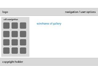
Followings are the first sketches:
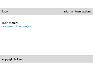
The Artist Cafe' should be done following the idea of 'defile fashion bars and lounge" website, created by lumen studio [www.lumenstudio.net], illustrated in the book 'web design: studio - icons' (Ed Julius Wiedemann), p. 116, that uses a banner (or menu?) with shadows of different people in different poses... Anyway, we'll try to create s menu of the similar kind, which will show the artists' shadows (probably taken by us), where we can view anyone's profile by clicking on his or her shadow.
The Gellery section contains, of course, products created by the studio, together with their descriptions, this normally requires a database of php-sql or flash-xml, yet since our client doesnt specifically require it, we might as well do it on pure html. Though, we'll probably consider database processing in view of the need for 'professional' and 'easy to update' website... :)
That's all for now. Any suggestion / objection / adjustment that needs to be dealt with should be carried out asap. We've got time constrain on this! :)
Best wishes...
Followings are the first sketches:


The Artist Cafe' should be done following the idea of 'defile fashion bars and lounge" website, created by lumen studio [www.lumenstudio.net], illustrated in the book 'web design: studio - icons' (Ed Julius Wiedemann), p. 116, that uses a banner (or menu?) with shadows of different people in different poses... Anyway, we'll try to create s menu of the similar kind, which will show the artists' shadows (probably taken by us), where we can view anyone's profile by clicking on his or her shadow.
The Gellery section contains, of course, products created by the studio, together with their descriptions, this normally requires a database of php-sql or flash-xml, yet since our client doesnt specifically require it, we might as well do it on pure html. Though, we'll probably consider database processing in view of the need for 'professional' and 'easy to update' website... :)
That's all for now. Any suggestion / objection / adjustment that needs to be dealt with should be carried out asap. We've got time constrain on this! :)
Best wishes...
Saturday, November 10, 2007
Vinamation project - warm up
the situation is that we did meet the client, Mr Tu Nguyen, on Wednesday. We had a comfortable meeting between both group members and client at highlands coffee :)
Mr Tu Nguyen is very joyful, friendly, enthusiastic and patient to answer all the questions. So we were really easy to get some useful informations for our project.
We intend to complete our proposal earlier two days for checking, collecting and combination
Now project is definitely in progress
...It's very interesting to work with two talented, hard working members. So I completely believe that we will have a great project with these guys ...
until now, we got no problem for this project (client is easy to contact, members are creative!)
Sunday, November 4, 2007
Hello word from Khang
Hi all :)
First I'd love to show my gratitude for our leader, ms Xuan, who has created this blog for the team DXK in the Vinamation website project - DIM3 at RMIT Vietnam
Then, it's simply a 'hi' from me to other members of the team, and of course, to our teacher, ms Tuyet as well :)
Hope we'll come out with a job-well-done project =) See you guys around! :)
Subscribe to:
Posts (Atom)